Glaciers#
Glaciers explorer using Datashader#
This notebook provides an annotated hvPlot+Panel implementation of a dashboard originally developed by Fabien Maussion in Plotly+Dash for viewing data about the Earth’s glaciers from the Open Global Glacier Model.
import numpy as np
import pandas as pd
import holoviews as hv
import panel as pn
import hvplot.pandas # noqa
from colorcet import bmy
from holoviews.util.transform import lon_lat_to_easting_northing as ll_en
Load the data#
Here we will load the glaciers data and project the latitudes and longitudes to Google Mercator coordinates, which will allow us to plot it on top of a tile source. We do this by using the lon_lat_to_easting_northing function from holoviews.
We also use the pn.state.as_cached function to cache the data to ensure that only the first visitor to our app has to load the data.
def load_data():
df = pd.read_csv('data/oggm_glacier_explorer.csv')
df['x'], df['y'] = ll_en(df.cenlon, df.cenlat)
return df
df = pn.state.as_cached('glaciers', load_data)
df.tail()
| rgi_id | cenlon | cenlat | area_km2 | glacier_type | terminus_type | mean_elev | max_elev | min_elev | avg_temp_at_mean_elev | avg_prcp | x | y | |
|---|---|---|---|---|---|---|---|---|---|---|---|---|---|
| 213745 | RGI60-18.03533 | 170.354 | -43.4215 | 0.189 | Glacier | Land-terminating | 1704.858276 | 2102.0 | 1231.0 | 2.992555 | 6277.991881 | 1.896372e+07 | -5.376350e+06 |
| 213746 | RGI60-18.03534 | 170.349 | -43.4550 | 0.040 | Glacier | Land-terminating | 2105.564209 | 2261.0 | 1906.0 | 0.502311 | 6274.274146 | 1.896316e+07 | -5.381486e+06 |
| 213747 | RGI60-18.03535 | 170.351 | -43.4400 | 0.184 | Glacier | Land-terminating | 1999.645874 | 2270.0 | 1693.0 | 1.187901 | 6274.274146 | 1.896339e+07 | -5.379186e+06 |
| 213748 | RGI60-18.03536 | 170.364 | -43.4106 | 0.111 | Glacier | Land-terminating | 1812.489014 | 1943.0 | 1597.0 | 2.392771 | 6154.064456 | 1.896483e+07 | -5.374680e+06 |
| 213749 | RGI60-18.03537 | 170.323 | -43.3829 | 0.085 | Glacier | Land-terminating | 1887.771484 | 1991.0 | 1785.0 | 1.351039 | 6890.991816 | 1.896027e+07 | -5.370436e+06 |
Add linked selections#
Linked selections are a way to interlink different plots which use the same data. With linked selections, you can explore how a particular subset of your data is rendered across the different types of plot you create.
All we have to do to add linked selections to static plots is make a hv.link_selections instance and apply it to our plots:
Let’s create a pane that renders the count of total selections:
ls = hv.link_selections.instance()
def clear_selections(event):
ls.selection_expr = None
clear_button = pn.widgets.Button(name='Clear selection', align='center')
clear_button.param.watch(clear_selections, 'clicks');
total_area = df.area_km2.sum()
def count(data):
selected_area = np.sum(data['area_km2'])
selected_percentage = selected_area / total_area * 100
return f'## Glaciers selected: {len(data)} | Area: {selected_area:.0f} km² ({selected_percentage:.1f}%)</font>'
dynamic_count = pn.bind(count, ls.selection_param(df))
pn.Row(
pn.pane.Markdown(pn.bind(count, ls.selection_param(df)), align='center', width=600),
clear_button
)
Plot the data#
As you can see in the dataframe, there are a lot of things that could be plotted about this dataset, but following the previous version let’s focus on the lat/lon location, elevation, temperature, and precipitation. We’ll use tools from HoloViz, starting with HvPlot as an easy way to build interactive Bokeh plots.
We now create different types of plot to display different aspects of the data. With the created link_selections instance, we can inspect how selecting an area of one plot will also render the same data point in the other plots.
geo = df.hvplot.points(
'x', 'y', rasterize=True, tools=['hover'], tiles='ESRI', cmap=bmy, logz=True, colorbar=True,
xaxis=None, yaxis=False, ylim=(-7452837.583633271, 6349198.00989753), min_height=400, responsive=True
).opts('Tiles', alpha=0.8, bgcolor='black')
scatter = df.hvplot.scatter(
'mean_elev', 'cenlat', rasterize=True, fontscale=1.2, grid=True,
xlabel='Elevation', ylabel='Latitude (degree)', responsive=True, min_height=400,
)
temp = df.hvplot.hist(
'avg_temp_at_mean_elev', fontscale=1.2, bins=50, responsive=True, min_height=350, fill_color='#f1948a'
)
precipitation = df.hvplot.hist(
'avg_prcp', fontscale=1.2, bins=50, responsive=True, min_height=350, fill_color='#85c1e9'
)
plots = pn.pane.HoloViews(ls(geo + scatter + temp + precipitation).cols(2).opts(sizing_mode='stretch_both'))
plots
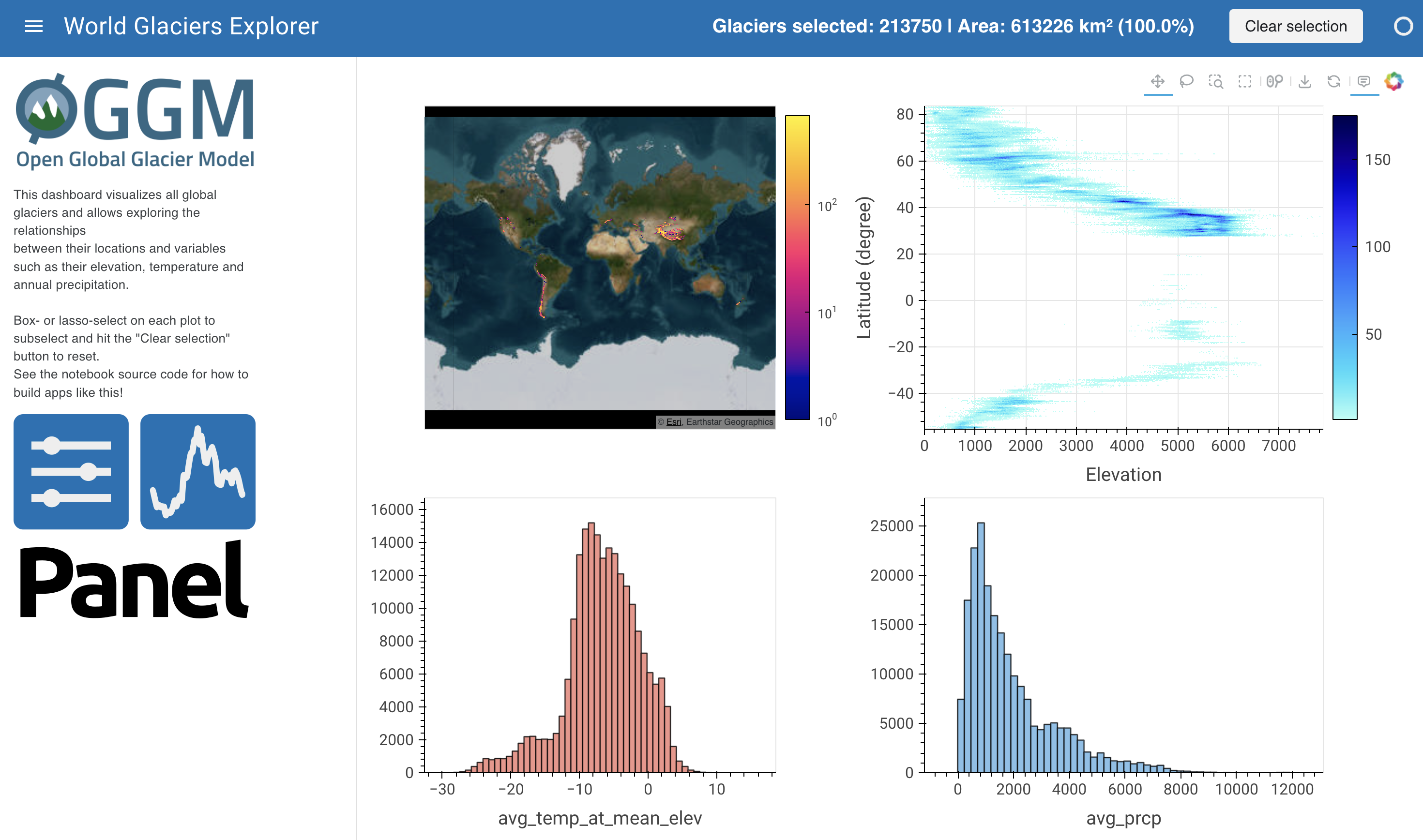
In the top left we’ve overlaid the location centers on a web-based map of the Earth, separately making a scatterplot of those same datapoints in the top right with elevation versus latitude. The bottom rows show histograms of temperature and precipitation for the whole set of glaciers. Of course, these are just some of the many plots that could be constructed from this data; see holoviews.org for inspiration.
Dashboard#
The code and plots above should be fine for exploring this data in a notebook, but let’s go further and make a dashboard using Panel.
We can add static text, Markdown, or HTML items like a title, instructions, and logos.
If you want detailed control over the formatting, you could define these items in a separate Jinja2 template. But here, let’s put it all together using the panel.pane module, which can display many python objects and plots from many different libraries. You’ll then get an app with widgets and plots usable from within the notebook:
instruction = pn.pane.Markdown("""
This dashboard visualizes all global glaciers and allows exploring the relationships
between their locations and variables such as their elevation, temperature and annual precipitation.
<br>Box- or lasso-select on each plot to subselect and hit the "Clear selection" button to reset.
See the notebook source code for how to build apps like this!""", width=250)
panel_logo = pn.pane.PNG(
'https://panel.holoviz.org/_static/logo_stacked.png',
link_url='https://panel.holoviz.org', width=250, align='center'
)
oggm_logo = pn.pane.PNG(
'./assets/oggm_logo.png',
link_url='https://oggm.org/', width=250, align='center'
)
header = pn.Row(
pn.layout.HSpacer(),
dynamic_count,
clear_button,
)
sidebar = pn.Column(oggm_logo, instruction, panel_logo,)
pn.Column(header, pn.Row(sidebar, plots), min_height=900)
Template#
Now we have a fully functional dashboard here in the notebook. However, we can build a Template to give this dashboard a more polished look and feel when deployed, reflecting the image shown at the top of the notebook:
template = pn.template.MaterialTemplate(title='World Glaciers Explorer')
template.header.append(
pn.Row(
pn.layout.HSpacer(),
dynamic_count,
clear_button,
)
)
template.sidebar.extend([
oggm_logo,
instruction,
panel_logo,
])
template.main.append(plots)
template.servable();
Running the cell above will open a standalone dashboard in a new browser tab where you can select and explore your data to your heart’s content, and share it with anyone else interested in this topic! Or you can use the above approach to make your own custom dashboard for just about anything you want to visualize, with plots from just about any plotting library and arbitrary custom interactivity for libraries that support it.