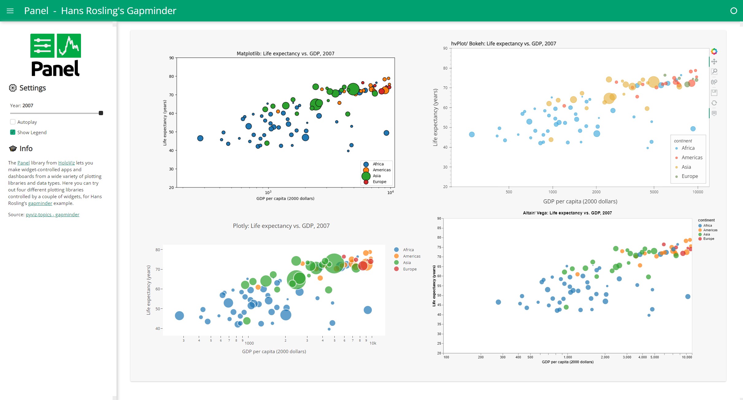
Gapminders#
The Panel library from HoloViz lets you make widget-controlled apps and dashboards from a wide variety of plotting libraries and data types.
Here we set up four different plotting libraries controlled by a couple of widgets, for Hans Rosling’s gapminder example.
import warnings

import numpy as np
import pandas as pd
import panel as pn

import altair as alt
import plotly.graph_objs as go
import plotly.io as pio
import matplotlib.pyplot as plt
import hvplot.pandas  # noqa

warnings.simplefilter('ignore')
pn.extension('vega', 'plotly', defer_load=True, sizing_mode="stretch_width")
We need to define some configuration
XLABEL = 'GDP per capita (2000 dollars)'
YLABEL = 'Life expectancy (years)'
YLIM = (20, 90)
HEIGHT=500 # pixels
WIDTH=500 # pixels
ACCENT="#00A170"

PERIOD = 1000 # miliseconds
Extract the dataset#
First, we’ll get the data into a Pandas dataframe. We use the built in cache to speed up the app.
@pn.cache
def get_dataset():
    url = 'https://raw.githubusercontent.com/plotly/datasets/master/gapminderDataFiveYear.csv'
    return pd.read_csv(url)
dataset = get_dataset()
dataset.sample(10)
| country | year | pop | continent | lifeExp | gdpPercap | |
|---|---|---|---|---|---|---|
| 1181 | Panama | 1977 | 1839782.0 | Americas | 68.681 | 5351.912144 |
| 1400 | Somalia | 1992 | 6099799.0 | Africa | 39.658 | 926.960296 |
| 705 | India | 1997 | 959000000.0 | Asia | 61.765 | 1458.817442 |
| 377 | Croatia | 1977 | 4318673.0 | Europe | 70.640 | 11305.385170 |
| 577 | Ghana | 1957 | 6391288.0 | Africa | 44.779 | 1043.561537 |
| 1147 | Norway | 1987 | 4186147.0 | Europe | 75.890 | 31540.974800 |
| 1290 | Rwanda | 1982 | 5507565.0 | Africa | 46.218 | 881.570647 |
| 320 | Comoros | 1992 | 454429.0 | Africa | 57.939 | 1246.907370 |
| 1567 | Tunisia | 1987 | 7724976.0 | Africa | 66.894 | 3810.419296 |
| 925 | Malawi | 1957 | 3221238.0 | Africa | 37.207 | 416.369806 |
YEARS = [int(year) for year in dataset.year.unique()]
YEARS
[1952, 1957, 1962, 1967, 1972, 1977, 1982, 1987, 1992, 1997, 2002, 2007]
Transform the dataset to plots#
Now let’s define helper functions and functions to plot this dataset with Matplotlib, Plotly, Altair, and hvPlot (using HoloViews and Bokeh).
@pn.cache
def get_data(year):
    df = dataset[(dataset.year==year) & (dataset.gdpPercap < 10000)].copy()
    df['size'] = np.sqrt(df['pop']*2.666051223553066e-05)
    df['size_hvplot'] = df['size']*6
    return df

def get_title(library, year):
    return f"{library}: Life expectancy vs. GDP, {year}"

def get_xlim(data):
    return (data['gdpPercap'].min()-100,data['gdpPercap'].max()+1000)
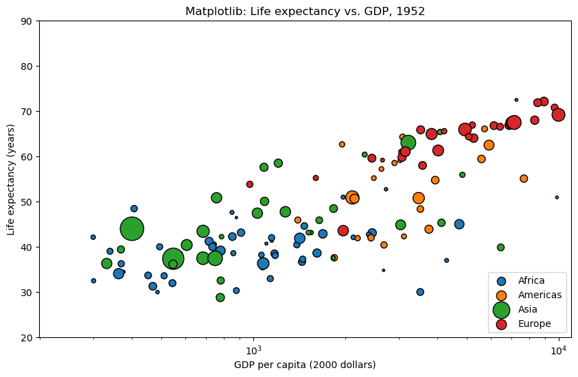
Let’s define the Matplotlib plotting function.
plt.rcParams.update({
    "savefig.facecolor": (0.0, 0.0, 0.0, 0.0),
})


@pn.cache
def mpl_view(year=1952, show_legend=True):
    data = get_data(year)
    title = get_title("Matplotlib", year)
    xlim = get_xlim(data)

    plot = plt.figure(figsize=(10, 6), facecolor=(0, 0, 0, 0))
    ax = plot.add_subplot(111)
    ax.set_xscale("log")
    ax.set_title(title)
    ax.set_xlabel(XLABEL)
    ax.set_ylabel(YLABEL)
    ax.set_ylim(YLIM)
    ax.set_xlim(xlim)

    for continent, df in data.groupby('continent'):
        ax.scatter(df.gdpPercap, y=df.lifeExp, s=df['size']*5,
                   edgecolor='black', label=continent)

    if show_legend:
        ax.legend(loc=4)

    plt.close(plot)
    return plot

mpl_view(1952, True)
Let’s define the Plotly plotting function.
pio.templates.default = None

@pn.cache
def plotly_view(year=1952, show_legend=True):
    data = get_data(year)
    title = get_title("Plotly", year)

    traces = []
    for continent, df in data.groupby('continent'):
        marker=dict(symbol='circle', sizemode='area', sizeref=0.1, size=df['size'], line=dict(width=2))
        traces.append(go.Scatter(x=df.gdpPercap, y=df.lifeExp, mode='markers', marker=marker, name=continent, text=df.country))

    axis_opts = dict(gridcolor='rgb(255, 255, 255)', zerolinewidth=1, ticklen=5, gridwidth=2)
    layout = go.Layout(
        title=title, showlegend=show_legend,
        xaxis=dict(title=XLABEL, type='log', **axis_opts),
        yaxis=dict(title=YLABEL, **axis_opts),
        autosize=True, paper_bgcolor='rgba(0,0,0,0)',
    )

    return go.Figure(data=traces, layout=layout)

plotly_view()
Let’s define the Altair plotting function.
@pn.cache
def altair_view(year=1952, show_legend=True, height="container", width="container"):
    data = get_data(year)
    title = get_title("Altair/ Vega", year)
    legend= ({} if show_legend else {'legend': None})
    return (
        alt.Chart(data)
            .mark_circle().encode(
                alt.X('gdpPercap:Q', scale=alt.Scale(type='log'), axis=alt.Axis(title=XLABEL)),
                alt.Y('lifeExp:Q', scale=alt.Scale(zero=False, domain=YLIM), axis=alt.Axis(title=YLABEL)),
                size=alt.Size('pop:Q', scale=alt.Scale(type="log"), legend=None),
                color=alt.Color('continent', scale=alt.Scale(scheme="category10"), **legend),
                tooltip=['continent','country'])
            .configure_axis(grid=False)
            .properties(title=title, height=height, width=width, background='rgba(0,0,0,0)')
            .configure_view(fill="white")
            .interactive()
    )

altair_view(height=HEIGHT-100, width=1000)
Let’s define the hvPlot plotting function. Please note that hvPlot is the recommended entry point to the HoloViz plotting ecosystem.
@pn.cache
def hvplot_view(year=1952, show_legend=True):
    data = get_data(year)
    title = get_title("hvPlot/ Bokeh", year)
    xlim = get_xlim(data)
    return data.hvplot.scatter(
        'gdpPercap', 'lifeExp', by='continent', s='size_hvplot', alpha=0.8,
        logx=True, title=title, responsive=True, legend='bottom_right',
        hover_cols=['country'], ylim=YLIM, xlim=xlim, ylabel=YLABEL, xlabel=XLABEL
    )


hvplot_view().opts(height=400)
Define the widgets#
year = pn.widgets.DiscreteSlider(value=YEARS[-1], options=YEARS, name="Year")
show_legend = pn.widgets.Checkbox(value=True, name="Show Legend")
def play():
    print("play")
    if year.value == YEARS[-1]:
        year.value=YEARS[0]
        return

    index = YEARS.index(year.value)
    year.value = YEARS[index+1]

periodic_callback = pn.state.add_periodic_callback(play, start=False, period=PERIOD)
player = pn.widgets.Checkbox.from_param(periodic_callback.param.running, name="Autoplay")
widgets = pn.Column(year, player, show_legend, margin=(0,15))
widgets
Bind the plot functions to the widgets#
mpl_view    = pn.bind(mpl_view,    year=year, show_legend=show_legend)
plotly_view = pn.bind(plotly_view, year=year, show_legend=show_legend)
altair_view = pn.bind(altair_view, year=year, show_legend=show_legend)
hvplot_view = pn.bind(hvplot_view, year=year, show_legend=show_legend)
Layout the widgets#
logo  = pn.pane.PNG(
    "https://panel.holoviz.org/_static/logo_stacked.png",
    link_url="https://panel.holoviz.org", embed=False, width=150, align="center"
)

desc = """## 🎓 Info

The [Panel](http://panel.holoviz.org) library from [HoloViz](https://holoviz.org)
lets you make widget-controlled apps and dashboards from a wide variety of
plotting libraries and data types. Here you can try out four different plotting libraries
controlled by a couple of widgets, for Hans Rosling's
[gapminder](https://demo.bokeh.org/gapminder) example.
"""

settings = pn.Column(logo, "## ⚙️ Settings", widgets, desc)
settings
Layout the plots#
We layout the plots in a Gridbox with 2 columns. Please note Panel provides many other layouts that might be perfect for your use case.
plots = pn.layout.GridBox(
    pn.pane.Matplotlib(mpl_view, format='png', sizing_mode='scale_both', tight=True, margin=10),
    pn.pane.HoloViews(hvplot_view, sizing_mode='stretch_both', margin=10),
    pn.pane.Plotly(plotly_view, sizing_mode='stretch_both', margin=10),
    pn.pane.Vega(altair_view, sizing_mode='stretch_both', margin=10),
    ncols=2,
    sizing_mode="stretch_both"
)
plots
Configure the template#
Let us layout out the app in the nicely styled FastListTemplate.
pn.template.FastListTemplate(
    sidebar=[settings],
    main=[plots],
    site="Panel",
    site_url="https://panel.holoviz.org",
    title="Hans Rosling's Gapminder",
    header_background=ACCENT,
    accent_base_color=ACCENT,
    favicon="static/extensions/panel/images/favicon.ico",
    theme_toggle=False,
).servable();  # We add ; to avoid showing the app in the notebook
The final data app can be served via panel serve gapminders.ipynb.
It will look something like.